Cleaning up form UI
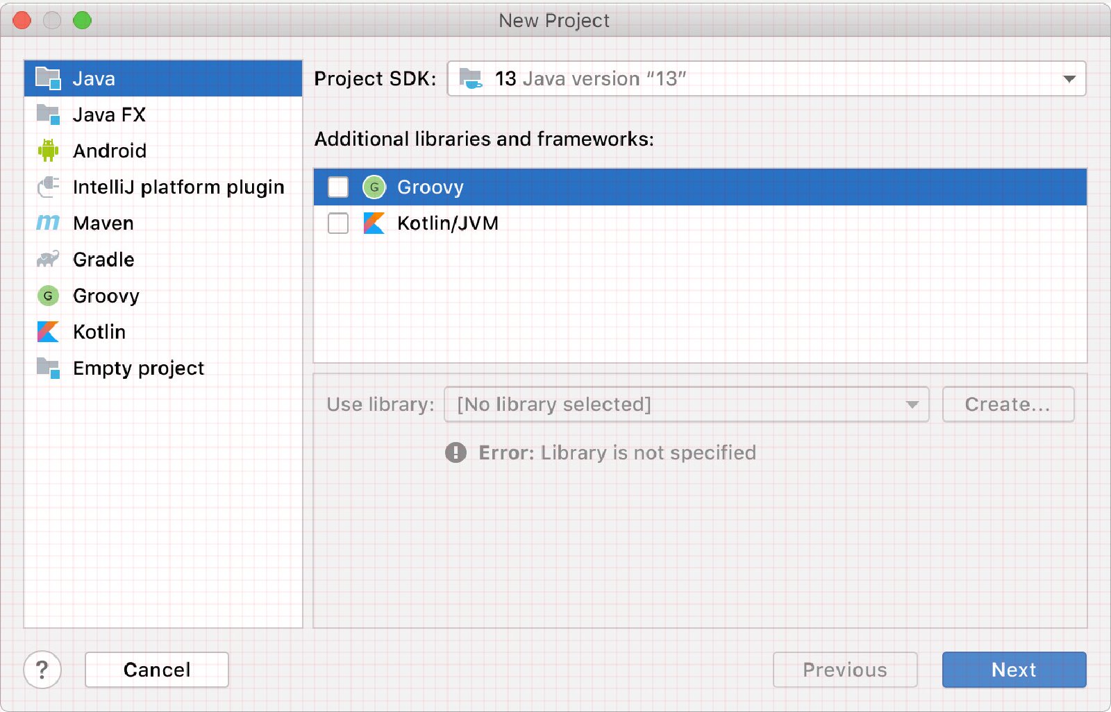
This is an article written by Tonsky about polishing UIs.
He starts from an (honestly already good) UI taken from IntelliJ IDEA and with some simple techniques he makes it even better. The most prominent technique is overlapping the UI with a grid to show the little imperfections present.
This simple technique can spot imbalances in many interfaces and doesn't require much effort. While not all the adjustments he made are wise if used in a web/responsive context, most of them are.
It's also easy to take UIs and to apply a grid over them as an exercise to improve order and balance inside our works. For instance, if you put a grid over this blog at this moment, the result is a complete mess.. maybe I need to do some something like this.